Friday, March 21, 2014

REVIEW: Sovereign #1

Writer: Chris Roberson
Artist: Paul Maybury
Color: Paul Maybury and Jordon Gibson
Letterer:  John J. Hill
Review: Cody "Madman" Miller

I have been on the fence about this book since I finished reading it.  I’m a fan of the fantasy genre as a whole, so there is no problem there.  This book just felt off balance.  I don’t know if that even makes sense, but I’m 99% sure I absolutely didn't like the artwork at all.  Not even a tiny little bit.  The pencils were weak and maybe in an effort to make up for this weakness, the inks decided to take over each and every page pretty much.  

Major turn off.  The characters were all just bland and didn't jump out at you.  Major turn off.  That’s nowhere near the worst of it.  It is the coloring that makes me want too, as the HCB’s founder and feature writer Mr. Davis Jr. once said about some bullshit Scott Snyder tried to pass off as a comic book (paraphrasing), “I’d like to buy a case of the shittiest beer I can find and piss all over it.”  The art was so bad, it was distracting.  I read this as fast as I could just so I could not be looking at it anymore.


That’s when I discovered I really didn't like the writing either.  It’s one of those books I hate where the book is divided into thirds and each third has its own characters, own story, and in this case, own misery.  A day later I can barely remember what the hell it’s about and I’m fairly certain I’m never touching this one ever again.  I don’t think I've disliked a book this mush since Death Moth.  I don’t care what anyone says, Image went wrong here...way wrong.  As long as they keep printing Saga, Manifest Destiny, and Rat Queens, I’m willing to forgive and forget this one.  Now, if you’ll excuse me, I have to go wash my eye holes.

Thursday, March 13, 2014

REVIEW: The Returning #1 and Monster & Madman #1

The Returning #1
Writer: Jason Starr
Artist: Andrea Matti
Cover: Frazer Irving
Publisher: Boom!
Review: Art Bee

“The boundaries which divide Life from Death are at best shadowy and vague. Who shall say where the one ends, and where the other begins?” Edgar Allen Poe

I have known for over a month The Returning was coming out, and I wanted to review it instantly. The cover on this book is so attractive and mysterious. For over a month I did not read the synopsis on Comixology, because I wanted the thrill of diving in with only the title and cover in my mind. My gut was not wrong on this one (for once). This was an amazing book.

The major theme of this book is fear, and it runs rampant throughout the story from the father, who is afraid to lose his daughter to the people afraid of “changers”,people with near death experiences. For the reader the suspense is incredible. Obviously Jason Starr has put forth the effort to plan out the story plot well, because the delivery of the first book of this four part mini-series is absolutely incredible.

The story is centered around Beth Turner, a regular teenager, whom has lost her mother tragically during a knife attack at the mall resulting in five dead. The person responsible for the attack was a woman, whom had a near death experience about a month prior. The changer had no idea why she had done the stabbing and was placed in a mental institution. The tragedy has left Beth's father in a very protective state.

People in Beth's world are coming out of near death experiences changed and acting bizarre or killing others, and this has lead to the development of a strong public prejudice to “changers”. Unfortunately Beth gets into a car accident on prom night and ends up in a coma after being clinically dead for five minutes. Once she wakes up from the coma in the hospital, we follow her and witness her experience the prejudice first hand.

I would really like to say more, but I do not want to deliver any spoilers. This is a strong start to what looks to be a great little tale. Starr has brought us a really unique story, and I am eager to read more.

Andrea Matti's artistic style is good. Her artwork shows Beth Turner is the focus of the story and truly projects Beth's emotions throughout the comic. My only reservation with saying all of this is that Matti does get sloppy in some of the panels, and Beth's plastic surgeon is working overtime on her lips. They keep getting thicker and thinner repeatedly during the comic. Also on page four Beth's father makes a spontaneous wardrobe change between panels. He goes from a checkered shirt to a plain one then back again without skipping a beat. Truly amazing (sarcastic)!

Major credit has to go to Frazer Irving for the cover of the comic. It is attractive and conveys the story. I admit it alone made me want to pick this book up, read it, and review it. That is why I made sure not to read anything about it prior to it coming out.

The Returning looks like it is going to be a great series that is full of suspense. Jump on board with me and lets see where Jason Starr takes us. 

Monster & Madman #1
The Secret History of Jack the Ripper and Frankenstein's Monster
Writer:  Steve Niles
Artist:   Damian Worm
Review:  Art Bee

When I went to pick up my comics at my local comic store this week, Monster & Madman from IDW was looking at me from the top of the stack.  This was not on my pull list, but Shawn, the store owner, had put it in our folders for Madman and me to check out.  The cover promised creepiness with the subtitle: “the secret history of Jack the Ripper and Frankenstein's Monster”.  As a horror fan, the classic monster tales hold a special place in my heart. 


Upon opening the comic, Frankenstein's Monster is shown walking in the snow, and Damien Worm has done a great job bringing it to life.  Unfortunately this is where I stop complementing Worm's artistic work.  On the next page, Frankenstein's Monster goes from wearing a white shirt to wearing a black one when he picks up a polar bear cub.  Consistency is something that is very important for the artwork of a comic book, otherwise the confusion detracts greatly from the story, making concentration on the title itself almost impossible.


The rest of the book's artwork had the feel of an old Nine Inch Nails music video, distorted and fuzzy.  Some of the panels look scribbled in frustration, and the use of shadow is completely abused to the point that therapy will be needed once the three issue mini-series is finished.

On top of the artwork being decrepit, the story is almost nonexistent.  Steve Niles provides us a narration with about as much depth as a sheet of paper.  As a writer, if you want to use an established character, you need to BUILD on the character and provide your own creativity to push the story.  In Monster & Madman, Niles is depending on the existing Frankenstein story knowledge to push his work forward.  Is it possible to fuck someone, whom has been dead for almost two centuries?  Niles has proven the answer to this question is: “Yes”.  I hope the ghost of Mary Shelley is following Steve Niles around trying to bag tag him constantly.   


This first issue only includes Jack the Ripper at the very end of the comic, but I am left wondering whether or not Frankenstein's Monster and Jack the Ripper have any business in the same story.  This idea just screams high and drunk creativity at its worst.   


I would like to wipe my ass with the pages of this comic book, but out of respect for Mary Shelley, it will be buried.  May she haunt these boys for their desecration of her art.


Friday, March 7, 2014

REVIEW: Batman and Two-Face no. 28

Writer: Peter J. Tomasi
Artist: Patrick Gleason

I stand by my statement that Batman is the love child of Bruce Lee and Sherlock Holmes. A man able to best any 6 opponents in simultaneous hand-to-hand combat and solve The Adventure of the Five Orange Pips before brunch. He's one if my favorite heroes for his mix of brain and brawn and DC is making it damn hard to like his comics lately.
   
Pretty well across the board, DCs Nu52 reboot has done nothing to inspire confidence in the brand. There's some decent books in the lot, don't misunderstand me. Swamp Thing is generally good, Suicide Squad still has the same chemistry it's always had, All-Star Western is great, and a handful of other titles walk the line between mediocre and periodically interesting.

When they aren't mired in horrid mega-events like Trinity of Sin or Forever Evil.


With great trepidation, I can't report any if those periodically interesting books feature Batman.
With the exception of Justice League.

Periodically...

I used to roll my eyes at a Grant Morrison Batman story, but in these grim days I yearn for the time when Wacky Grant was penning the Dark Knight.
 
The chief culprit amongst the Rogues Gallery of pedestrian Batman writers is Scott Snyder. From the Court of Owls, which started out interestingly enough only to peter out with an uninspiring end, to Death of the Family, which started out interestingly enough only to peter out with a horribly uninspiring end, to his attempt to out-Frank Miller, Frank Miller's Year One with his own Year Zero, Snyder consistently fails to deliver.

Which is unfortunate, considering I (begrudgingly) enjoy his Vertigo book, The Wake. Pick it up, it's worth it.
 
 But we're not talking about Lovecraftian merfolk taking over the surface world here.
   
We're talking about the Goddamn Batman.
   
Batman and Two-Face #28 is the conclusion of a multi-part story arc retelling, in true Nu52 fashion, the origin of Two-Face by stripping down the the pre-established canon to its core and leaving naught but the fact that Harvey was a lawyer as now he's a bad guy with a scarred mug and a coin.

Gone is the dramatic courtroom acid-bath. Gone is any Gilda Dent (spoiler alert: like so much Ma & Pa Kent she's already dead in the Nu52). Gone is...most of the interesting facets of the character, truth be told.
   
The issue picks up with Two-Face captured and about to be executed on live television, with Batman en-route to the rescue. Riding shotgun with The Batman is one of the Mckillen Sisters, a fiery redheaded set of twin Irish lasses who have been shoehorned into Batman and Two-Face's shared origin in a hackneyed attempt to rewrite comic history. The McKillen Sisters are Irish Mobsters, redheaded and hot-tempered as previously mentioned, and suren ye wouldnae be surprised tae find twa more stereotypical characters from Erin's Isle in all if comicdom, short of X-Men's Banshee from the 1960s.
Faith and Begorrah.

...okay, they don't actually talk like that but they may as well. They probably drink Bushmills and say up late singing Pogues songs and telling sad stories about The Troubles.
 
 The sisters are also responsible for Gilda's death and Harvey's scarring and subsequent descent into villainy.
If anyone was curious...

A majority of the issue was composed of Batman and Two-Face fighting goons whilst pausing mid-combat for an obligatory, "Harvey, there's still good in you, I can feel it!", "No way, man! I'm totes evil!" exchange.
   
There are a few great spots in the book. Batman tosses Harvey his trademark coin after he'd lost it in a previous issue, Batman wielding a 'Liberty and Justice' courtroom seal like a shield, and Two-Face flipping the coin for Jim Gordon's fate only for it to land on edge in the mud. The resulting panels are great, illustrating the dichotomy and turmoil between Harvey's two sides.
 
The issue wraps up with a classic Batman/Gordon chummy rooftop 'fighting the good fight' routine, the remaining McKillan Sister giving a rousing speech in a prison yard that includes that old chestnut, "every man has two wolves fighting inside him yadda yadda".

I've not done the research to confirm the veracity of this proverb an an ancient Native American cliche, but regardless...
 
Oh, and our closer involves what may or may not be a red herring, or may or may not be Two-Face shooting himself in the head.

Hard to say, it was off-panel, but if he shows up as Three-Face next time we'll know what happened.
   
All in all, these new Batman stories are boiling with mediocrity. If Nu52 writers aren't deconstructing and rewriting origins, they're attempting to write the new, definitive epic story. It's an admirable goal, but the focus needs to be on good storytelling with the hopes that it incidentally becomes a classic. You can't set out to write the new Year One, or Longbow Hunters, Watchmen or Emerald Dawn. It has to happen naturally, organically.
   
I'm not going to stop reading Batman. Fans of M.A.S.H. didn't stop watching because of angsty, preachy Alan Alda directed episodes, so I'll stick it out, hoping that this stretch of Tepid Tales of the Caped Crusader will be over sooner than later.

Here's to hoping...

Thursday, February 27, 2014

REVIEW: New Warriors #1


Writer: Christopher Yost
Art: Marcus To
Color Art: David Curiel
Review: Cody "Madman" Miller

 I’m not going to lie, for better or worse, Marvel had my four bucks a month ago when I first caught wind of the re-launch of the New Warriors.  Now granted I haven’t read a New Warriors book in about a decade, but I wasn’t going to let that stop me.

I had a brief love affair with the Warriors somewhere in the bleak landscape that was the 90’s.  It was just after the Maximum Cloneage debacle had ended and Scarlet Spider, the Ben Riley version, had joined the team.  I couldn’t help it. As horrible as the whole clone saga was, I just couldn’t look away.  To be honest, I was and still am a fan of the Scarlet Spider, be it Ben Riley, may he rest in peace (actually he turned to ash after being skewered by the Green Gobo’s glider), or the rougher less goodie goodie Kaine version that we have been blessed with at the present time.  I was really bummed when the recent Scarlet Spider run came to an end, but William was heart broken. Don’t let him fool you , Mr. Dubbeld and myself had to basically put WRDJ on suicide watch over that deal.  I like my Scarlet Spider comics, but that guy is just plain cuckoo for SS books.

The good news is the Marvel powers that be have dropped the SS right smack dab in the middle of this here new New Warriors book.  Major selling point.  It’ll be really interesting to see how his non-hero approach fits in with the team.
Other than that, Robbie Baldwin aka Speedball, is the only reason I bought this one.  I love me some Speedball with his colorful, panel saturating, kinetic balls.  That’s right, I said it.  I love my panels saturated with Robbie’s kinetic balls…
 
Madman Loves Him Some Kinetic Balls WRDJ
This first issue really isn’t all that exciting to be blatantly honest.  It’s really just setting up events to come.  Now being as it is the first issue, you may find that hard to believe, but I swear it’s true.  We’re given a page or two to set up each of the heroes that will soon make up our new team of warriors: The Nova, Justice, Hummingbird, Sun Girl, and Namora.  I know, I know, zero Night Thrasher…high five, I’ve never liked that jack ass.  Not even a little.

The actual writing was really tight, even taking into consideration that this first issue was both scattered and jumpy.  I found the art to be top notch as well.  I’m seriously looking forward to reading the hell out of this title and you should be too.  So join in, sign up, and saturate your eye holes with colorful kinetic balls, and the only relevant non relevant super team in the business.

Wednesday, February 19, 2014

REVIEW: Busan Comic World

Review: William R. Davis Jr. 


Living in Asia has kept me a bit isolated from the world of American comics. Those little conversations when you're picking up your weekly books from your local comic sage at your LCS are invaluable. But what really lets me keep my finger on the pulse of the comic world is the oppotunity to attend comic conventions. From a journalistic standpoint I am able to arrange interviews with creators and be the first to learn about new projects from every company, large and small alike. Academically, I am able to attend panels and discussions regarding every comic related topic, so they can also be very educational as well. From a fan standpoint I am able to shake the hands of and interact with all of my heroes in the industry, and also get a chance to meet the up and coming stars of the future. I am also able to purchase books that are not yet widely distributed. And as a fanboy, I am able to geek out with my friends, pick up back issues for pennies on the dollar, check out the Cosplay, and interact with the comic community as a whole.

Recently I read that a convention was coming to my city: Busan, South Korea. Busan is a beach city, the second largest in South Korea, and it is a little smaller than the city of Los Angeles (Banana for Scale). But what is a "con" in South Korea? Like much of my adopted homeland it was a bit shrouded in mystery due to Korea's culture and traditions being vastly different from American ones. Would there be rows and rows of artists and creators pumping out sketches, a sea of endless back issues to thumb through, academic talks and panels, large amounts of Cosplay? Knowing Korea as well as I do, I knew it would be different. I was not wrong, but in a few ways it was very similar to the cons that we all know and love.

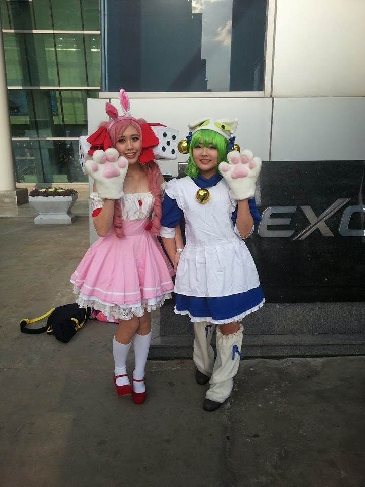
Admittedly, I do not have a strong love or knowledge of Japanese Manga. In many ways it eclipses the popularity of traditional and non-traditional American comics, having a fanatical fanbase that knows just about every facet of the medium. Busan Comic World was centered around Japanese Manga and its almost endless sea of various characters. It was not selling books, or hosting panels, but instead revolved around elaborate Cosplay, which could be found everywhere. A large Cosplay contest was the focal point of this event, and the ratio of elaborate costumes to those wearing none was extremely high, way higher than any American event. There were almost no creators present, and no books for sale, but sketches could be commissioned by amateur artists of your favorite manga characters. There was one small exhibit on a back wall, but the event itself was very small in scope and we walked through it completely in less than one hour.

What I did see was a strong sense of community between the fans. The Cosplay was extremely elaborate, and the costumes were undoubtedly expensive to construct in most cases. Fans and spectators delighted in taking pictures. When asking for one you were expected to say something along the lines of: "Picture please. Can you please do your pose?" The Cosplayer would then strike a pose indicative of the character and then a picture would be taken. It was nice to see the Cosplayers being so accommodating, and the fans showing such a thorough appreciation of their efforts. All in all it was almost a complete departure from an American comic book convention. While I did not know the characters being portrayed, or get a chance to feel the satisfaction of walking a massive convention floor hall for three straight days participating in everything American comics, I did leave with a positive feeling regarding the event. It was well worth my 4000 Won (Roughly $4) to see a different community come together in appreciation of what is obviously a passion to so many. At the end of the day however, there's no place like home.


Friday, February 14, 2014

REVIEW: Maximum Minimum Wage

Maximum Minimum Wage
Writer/Artist: Bob Fingerman
Review: Will Dubbeld

     
Indy books, Underground Comix, Small Press, Creator-Owned.
 
These are amongst the most glorious words in comicdom, right up there with 'New Comic Day' and 'Man-Thing'. Not that there's anything wrong with the Big Two (well, there's a lot wrong, but anywho...), but there's always a measure of satisfaction in reading a book that was squeezed out of the heart of some guy or gal over the course of years, with endless nights toiling in a cruddy apartment, eking out a living whilst attempting to craft a labor of comic love.
 
 
At least that's how I envision the independent comic book creation process.
 
I suppose there could be some trust fund babies slinging Indy Books, but I kinda doubt it. Thus Spake Maximum Minimum Wage. Paging, once again, through Previews, I discovered a solicit for Bob Fingerman's new Minimum Wage series. The description grabbed me immediately and the accompanying preview art sealed the deal. The book screamed the primal scream of a time when Fantagraphics was the premier publisher of Indy Books and Image was slinging shoulder pads and belt pouches.
 
Times, they are a changin'...
 
Solicited along with the new Minimum Wage series was a plug for Maximum Minimum Wage, an oversized hardcover collection of Fingerman's original series. I gave it a good, long look, but ultimately didn't order the hardcover as it was a bit on the spendy side.
Not that I balk at droppin' bills at the comic shop, but I'm trying (mostly) to be a bit more frugal.
 
These funnybooks ain't free, folks.
 
Upon reading Minimum Wage no. 1, I immediately regretted not ordering the hardcover.
The first issue was phenomenal, a slice of life snapshot of some poor schmuck, recently split from his wife and bemoaning his fleeting youth.
 
And the damn thing near demanded I read the preceding series.
Cursing my sporadic frugality, I found a significantly cheaper copy of Maximum Minimum Wage on the Internets and promptly ordered. Upon receipt, I devoured the book in a couple of days and was awestruck by the contents. 
 
Minimum Wage is a slice-of-life, semi autobiographical account of a budding cartoonist named Rob, his mildly damaged girlfriend Sylvia, and their potpourri of friends and coworkers in '90s New York City. 
     
Fingerman paints us a picture of an Everyman, albeit a bit exaggerated without delving into the fantastical. Moving in with your girlfriend, putting up with neurotic family, friends and coworkers, and marriage. It's a book about common, everyday occurrences presented in an uncommon and interesting manner. The characters are evocative of those idiot friends, those crazy exes, those asshole supervisors we all have or have had. But it's not us, not our obnoxious Godzilla-fanboy friend or archetypical Italian grandmother. It's a mildly oblique version of these friends and family, in the same reality as ours, but just slightly to the left. Much of the book is tongue in cheek humor, but Bob Fingerman touches on some very real issues through the life of Rob, his hapless Everyman. There is a sequence involving Rob and Sylvia and their decision have an abortion that disturbed me more than anything I'd read in a comic in quite a while. It wasn't a graphic depiction, it was merely a frank discussion and emotive sequence that unsettled me. I'm not hypersensitive when it comes to the topic of abortion, nor am I easily shaken, but that particular chapter of Minimum Wage was so vivid, so raw, that I was unnerved. If that was Fingerman's intention, well done.  
 
After that bit of gravitas...
    
The Art! The art in Minimum Wage is fantastic. The seemingly simplified black-and-white line art contained some deceptively complex pieces of background and character studies. Every so often, a background character or passerby would be rendered with such an amount of detail, you know it was Fingerman's landlord, his aunt, his pizza delivery boy, or the guy who ran the 7-11 down the street from his apartment. The character designs of the main characters are great, not overdone but neither are they simplified to the point of monotony. The characters reminded me stylistically of the Mission Hill animated series from some years ago. An R-rated Mission Hill...
 
Bonus features, bonus features, bonus features, will you guys get your money's worth out of this book!
 
The main story concludes on pg. 236. The book clocks out at pg. 384. You do the math, but it's somewhere in the neighborhood of shitloads of extras, and none of it felt like filler. The next hundred (100!) pages are early stories/incarnations of Minimum Wage, followed by a cover gallery, pin ups from Peter Bagge, Gilbert Hernandez, and some other Indy luminaries I could name drop to be hip.
 
Closing out the book is some sketches, character designs, and an unused script.
     
Minimum Wage is a less foul Robert Crumb, a less zany Fabulous Furry Freak Brothers, a more fanciful American Splendor, and nearly as full of human drama and study as Strangers In Paradise. Or Omaha the Cat Dancer, but without all the graphic, anthropomorphic cat-sex.
 
Maximum Minimum Wage is a 384 page hardcover available from Image Comics for the worth-the-money price of $34.99. Skip a few books from the Big Two for a couple of weeks and buy this collection instead. You'll feel better about yourself, and Spider-Man will still be there next week.
 
Plus, this book has a dust jacket and one of those fancy bookmarks that's sewn into the binding.

Friday, February 7, 2014

Review: The Horror Show #1


Writer:  James Maddox
Artist:  Todd Beistel
Review:  Arthur Black

Recently I was exposed to an independent writer's comic: The Horror Show #1, through another writer.    Although the title is not original, it was a pretty decent read.  The Horror Show #1 has a very fascinating story with characters, whom are not complex but believable.  Todd Beistel does a great job with the art work in this one. 

Since the tender age of twelve, my infatuation with the horror genre has come to include movies, books, comics, and magazines.  When it comes to comics, many horror comics fall short in my opinion as they do not provoke a reaction. Horror should make you jump, feel scared, or invoke shock.  This book did get a reaction out of me; something that few comics have ever done.

James Maddox starts the story with a pair of friends at a cabin in the woods drinking beer and reminiscing.  Then they are disturbed by a noise outside.  When one of them looks, there is a swarm of zombies marching toward the cabin.  At this point, my thoughts were, “Oh my God, another Zombie book,” but I stuck with it and found more than I anticipated.  The zombie attack was a prank set up by one of the friends, and the writer does a superb job in providing us with this information.  The story takes a drastic turn.  Maddox provides a solid plot twist with the presentation of a monster crashing the prank.  Fortunately I am not going to ruin this with any more details for any of you readers. 

The artwork in this comic book is done with black and white inks splashed with red for dramatic effect.  This is not original, but effective.  Todd Beistel's style is accomplished and consistent.  His best work is on page eleven, where the actual monster is introduced.  This image actually made me recoil in shock.  That is what put it squarely in the horror genre.  Another noteworthy panel is on page twelve, a close-up of the monsters eye.  The details of this image are fantastic. Beistel's forte seems to be in his shading and shadowing, but his drawing of human heads and faces seems a little distorted. This may be on purpose for effect, but at least he is consistent.  In my opinion consistency from a comic book artist is more important than any other quality.

For Maddox and Beistel to tell this story as effectively as they did in only sixteen pages is very impressive.  Overall I would say this is a winner for the horror comic genre. The price is perfect as well.  The digital PDF is completely free. You can download it at http://www.brokeniconcomics.com/ths/ths.pdf.  If you like horror comics at all or would like to try one, check this one out.  It will only cost you some time, and it is sure to be worth it.