Friday, December 30, 2016

REVIEW: Inhumans vs X-Men #1

Writer: Charles Soule & Jeff Lemire
Penciler: Leinil Francis Yu
Inker: Gerry Alanguilan
Colorist: David Curiel
Review: Cody "IdentityCrisis" Miller

I’m way out of my element here, Donny. I don’t read or keep up with the X-Men or the Inhumans much…and by much I mean hardly ever. The last real X-Men book I can recall reading was a few years back when the X-Men were battling it out with the Avengers during AvX. I have a hard enough time keeping up with the Spider-verse let alone the stamina to keep up with Terrigen Clouds and Captain Laser-eye’s day to day...maybe if they had made better movies.

Thanks to the nifty “we put this here for you in case you don’t read X-Men or Inhuman books” section on the title page, I learned the Terrigen Mists,which are so precious to the Inhumans, have somehow suddenly become toxic to mutant-kind. Well, Cyclops just wasn’t going to let that crap happen on his watch, and well, Black Bolt killed the shit outta Cyclops.
I could applaud that. I have never been a fan of Cyclops and in fact I’d go so far as to say I hate him. I can’t really give you a justified reason as to why…it’s a long-lived hate, too. I’m glad he’s dead…again.

Tuesday, December 27, 2016

REVIEW: Doctor Strange/Punisher: Magic Bullets #1

Writer: John Barber
Storyboards: Jason Muir
Artist: Andrea Broccardo
Review: Will Dubbeld

Not so long ago Marvel graced us with another flash-in-the-pan crossover event/maxiseries/dollar snatch called Original Sin. It reeked of editorial mandate and pretty well spat on 40 some-odd years of Nick Fury and Howling Commandos storytelling. I don't blame scribe Jason Aaron so much as editors handing down unneeded continuity 'fixes' and otherwise mucking things up.
The art was on point, though...

Throughout the miasma of Original Sin one segment did shine, however, in the form of the most unlikely Buddy Cop team-up in recent history:
Dr. Strange and The Punisher.
Aside from his brief stint as a supernatural agent of God, Punisher is about as mundane and nonmagical as they come, and I'm fairly certain Stephen Strange doesn't know an AR-14 from an AK-47. Sticking these two together seemed to be a perfect Odd Couple scenario and it played out wonderfully.

Sunday, December 18, 2016

REVIEW: A.D.: After Death Book One

Writer: Scott Snyder
Illustrator: Jeff Lemire
Letterer: Steve Wands
Review: Art Bee

At my LCS I love finding amazing trades and graphic novels. They cost more than your normal floppies, but they can drop some awesomely hot story in your lap like a sack of hot taters. Yeah taters…the rest of the world knows them as potatoes. For those of us with a drawl in our lingo, they are taters.
Getting back to my original thought, I found a neat new graphic novel format, A.D.: After Death Book One, on the shelf with the other floppies at my LCS. It was a thicker cover with 65 pages of content for $5.99. This intrigued me greatly as did the splendid watercolor artwork inside. My only hesitation was the writer’s name, Scott Synder. In my opinion he has delivered some great work in the past in addition to some bottom of the barrel quality writing. The Hammond Comic Blog’s own Will Dubbeld greatly dislikes Mr. Snyder’s work and has vowed to avoid it all. He has stated, "Snyder has great ideas and his stories have a strong start, but he nearly always shits the bed in the third act".
(Editors note: I’m actually currently reading his Batman book, but that’s due to John Romita, Jr. on pencils. Love some JRJR…)

Friday, December 9, 2016

REVIEW: Warhammer 40,000: Will Of Iron

Writer: George Mann
Artist: Tazio Bettin
Colorist: Enrica Eren Angiolini
Review: Madman

Hells yes! I’ve wanted this comic for a long, long time, like eighteen years long, long time. I’ve been a huge fan of the table top miniature game Warhammer 40,000 for a long long time, like 22. You could say I was weaned into gaming in most regards with Warhammer. For those that don’t know, 40k involves moving miniature plastic troops, tanks, and just about any war machine you could possibly imagine coming out of the 41st Millennium around a 4x6ft table. That and a big damn rulebook with detailed specifics pertaining to every situation and individuals stats for each miniature dude. At first it was just some random thing that my buddies and I stumbled unto . . . it was better than Nintendo . . . it was before the internets . . . a reason to hang out. In the heyday of my youth when we were haunting our parents' basements braving: moldy spiders, head wounds from mashing into a light bulb, the smell of wood stored in the room next door, or (as rumor had it) a ghost. That’s pretty much all we did for a couple of years. I took a hiatus from all things involving a permanent residence during most of my 20s, and it wasn’t until 15 or so years later that I bought back into the hobby. Towards the end of my youthful run Games Workshop, the company that produced 40k, started to produce a comic series, and it was glorious. I loved that hell out of that comic back then and have read them many times since. I am so glad they’re back.

Friday, December 2, 2016

REVIEW: The Mummy: Palimpsest #1

Written by: Peter Milligan
Art by: Ronilson Freire
Review: Will Dubbeld

Regular visitors to this column (and yes, I'll be arrogant enough to presume there are regular visitors . . .) will have noticed I'm quite fond of pop culture from yesteryear. Film and comics books (clearly) from the 1940s through the '80s in particular capture the essence of what I consider the pinnacle of achievement for those genres.
Exceptions notwithstanding, I'll choose a classic noir or horror over a more contemporary counterpart.
Thus we arrive at Hammer Horror.

In the 1950s through the 1970s Hammer studios cranked out a bevy of gothic horror films through vehicles like Frankenstein Created Woman and Taste the Blood of Dracula. Without gushing over how sublime these films are, which I could do ad nauseum, I'll get to the heart of the matter. In addition to a regular diet of Dracula and Frankenstein movies, Hammer also produced a series of mummy films.

As in shambling Egyptian undead kings and the like.

Wednesday, November 30, 2016

REVIEW: Moonshine #1 - 2

Writer: Brian Azzarello
Art & Colors: Eduardo Risso
Review: Madman

I pulled the first issue of this series off of the shelf for two simple reasons: the title and the epic cover, which is hands down my favorite cover that I’ve seen on a comic in a while. Absolutely perfect. Who isn’t a fan of old school pinstripe-wearing wiseguys? Well, here were have three silhouetted in a grass field packing all kinds of nice toys . . . take my money. I’m not sure when the first issue came out. It just kind of got shelved until recently when issue two suddenly appeared in my folder at the LCS. That’s when I remember I hadn’t read the first issue yet, and it was for some strange reason residing inside of the curio cabinet. For the record, the 2nd  issue's cover is way less awesome than the 1st issue's eye candy, and that was a serious disappointment.

In truth, my love affair with this series sadly ended many pages before I finished reading the 1st issue. What started off like your classical wiseguy story of bootlegging, hustling, beat downs, etc. turned into something else that was taking me places I do not wish to go. Our adventure starts out innocently enough with a boss sending his top wiseguy from New York City down into the heart of Appalachia, Deliverance country deep, after the maker of what is apparently the best tasting moonshine ever. I can respect that . . . I’ve had some good moonshine.  

Friday, November 18, 2016

REVIEW: Cerebus in Hell? #1

Gustave Doré: penciller
Dante Alighieri: inker
Dave Sim: letterer
Sandeep Atwal: colorist

Review: Will Dubbeld

I've a bit of a tumultuous relationship with Cerebus the Aardvark. Dave Sim's nigh-legendary creation has been lauded, detracted, discussed, and managed to wedge itself firmly in my brain somewhere between exaltation and depression.
What started as a cheeky sendup of the sword-and-sorcery genre soon evolved into something else entirely.
A melange of drama, satire, metafiction, and frankly heavy work followed an otherwise lighter first volume.

I think I made through six or seven volumes before I had to step back for a bit. It's a amazing piece of writing, but my god does it get maudlin. For my own peace of mind I simply had to step away for a bit.
That was about 4 years ago . . .

In any case, when news of a new Cerebus miniseries dropped I opted to check it out. Sim has created a seminal work of fiction and I felt almost obligated to read his new comic.
Like I owed it to myself to see what Ol' Cerebus was up to these days.  

Saturday, November 12, 2016

REVIEW: Warlords of Appalachia #1

Writer: Phillip Kennedy Johnson
Illustrator: Jonas Scharf
Colorist: Doug Garbark
Letterer: Jim Campbell
Review: Art Bee

Why are movies like Mad Max, The Crow, and Gladiator such big hits with so many? Most of the time the killer in a movie is the “bad guy”, but when that killer is out to get vengeance for the
ones they love, we jump behind them and cheer for their efforts (plus it helps if it’s one of our favorite actors). It is hard to condemn one whose heart has been ripped out and stomped to
smithereens.

A few weeks ago Warlords of Appalachia #1 hit the shelves of my LCBS and caught my eye since my roots are in West Virginia. This comic is quite an original concept and could be a big hit
for BOOM! Studios.

Warlords of Appalachia starts shortly after the United States’ second Civil War, which started with Kentucky and other states seceding from the Union in 2041. The war is over and Kentucky
refuses to accept the sovereignty of the United States. The Union does not abandon the lone state, however. Aid pours in from the military as well as occupation, and other groups send assistance to the state in creative ways such as balloons and air drops.  

Saturday, November 5, 2016

Halloween Comicfest 2016


Peach and the Isle of Monsters #1

Written and created by Franco Aureliani
Artwork by Agnes Garbowska
Review by Will Dubbeld

Ah, Halloween Comicfest. It's like Free Comic Book Day, but not! It certainly hasn't got the clout that its May counterpart possesses, but is well worth supporting nevertheless. Any opportunity to spread the joy of funnybooks is okay by me. Halloween Comicfest has a similar formula as FCBD, giving away freebie comics contributed by a melange of companies as promo material.

Unfortunately many of the Halloween Comicfest and FCBD offerings are often reprinted comics plugging a hot new book or mega-event. Thankfully many of the smaller publishers aren't burdened by the pressure to pimp the new hotness and give out original pieces.
Thus Peach.

Saturday, October 29, 2016

REVIEW: Green Valley #1

Writer and Creator: Max Landis
Pencil: Guiseppe Camuncoli
Inker: Cliff Rathburn
Colorist: Jean Francois Beaulieu
Letterer: Pat Brosseau
Review: Art Bee

Image seems to have been pumping out some great hits over the last couple of years, but I am not sure if Green Valley is one of them. It is a medieval fantasy-style story with knights and barbarians galore. This team has done some things well and others not so well. This polarity is literal as the first half of the comic book is horrible and the second half is amazing. I will sum up the story plot then let’s look at these halves.

Bertwald, Ralphus, Gulliver, and Indrid meet with Barbarian Lord Brutus Gargus on a battlefield. The four humiliate the Barbarian Lord and make the army retreat. This seems to be the one mistake that begins it all as the cover states, or it may be them letting their guard down, for Brutus will come for revenge.

Friday, October 21, 2016

REVIEW: Love and Rockets Vol. IV #1

by Gilbert and Jaime Hernandez
Review: Will Dubbeld

I may have gotten in a bit over my head here . . .
Love and Rockets was an elusive, legendary comic book in my younger days. Ads were prevalent in those old Fantagraphics comics, lauding the genius of Los Bros Hernandez and this Love and Rockets creation of theirs. I wanted it. Fantagraphics ALWAYS produces quality books and Young Will was certain Love and Rockets was no exception.

Unfortunately, my local comic shops were never hip enough to order the book. Nary a back issue to be found, my entire collecting career. Frustrating as hell is what it was . . .
I chalked it up to scarcity, believing that Jaime and Gilbert slavishly produced one issue annually and printed only as many copies at the local Kinkos as they could afford on freelancer pay.
The comic just felt that real, that underground.

Saturday, October 15, 2016

REVIEW: The Great Lakes Avengers #1

Writer: Zac Gorman
Artist: Will Robson
Colors: Tamra Bonvillain
Letter: Joe Caramagna
Review: Madman

The tagline for this book completely sucked me in. It went something like this, “'All New, All Different?' No, thank you! New things are bad and different things are scary! Instead, why not join everybody's least favorite super-hero team, the Great Lakes Avengers", blah blah so on and so forth.

I really didn’t read anymore after that because, well, I was already sold. Every now and again I do enjoy the quirky irrelevant titles Marvel throws out. Sometimes I regret that decision, but sometimes it’s a solid win, such as The Superior Foes of Spiderman. I enjoyed the hell outta that run. Had I passed that up I would’ve missed Shocker running around NYC with Silvermane's head in a bowling ball bag and, well, that would’ve been very not cool. This book gave me that same vibe so here I am.

Friday, October 7, 2016

REVIEW: Home #3

Story: Todd Black
Art:  Beth Varni
Letters: Zakk Saam
Cover: Yashera Lynn Ames
Review: Art Bee

Here at HCB we have always preached the message of supporting independent comic book creators. Living in our philosophy, I am an avid follower and supporter of Kickstarter. There are six publications out there with my name attached to their development, but the credit goes to the creators. One of the most recent projects I have supported was Home #3, and with that support received issues one and two as well.

It takes a lot of creativity, guts, and devotion to get a project together and bring it to fruition. With that in mind, I always try to be kind to our indy creators in reviews while still being honest to you, our loyal and greatly appreciated readers. This review has been very hard to write to do justice to both. My opinions just flip-flopped five times while rereading and writing it.

Home is a tale of a young, beautiful, and underappreciated young woman named Elysia. She works as a janitor to make ends meet but finds her joy in computer coding, which she just understands naturally. The quality that makes others uneasy about her is her naturally blue hair. One of the main themes in the story is a strange code that appears sporadically all over the place. Elysia is able to manipulate this code to fix things or change things.  

Friday, September 23, 2016

REVIEW: Doom Patrol #1

Writer: Gerard Way
Artist: Nick Derington
Review: Will Dubbeld

I've had my ups and downs with Doom Patrol. I adore the concept of a team composed of just screwed-up superfolks, riddled with dysfunction, and still trying to maintain a status quo and fight the good fight. The roster has always been engaging, filled with robots, giant-girls, shapeshifters and other misfits of science, and I'm always willing to give 'em a read.

Unfortunately for Doom Patrol (and myself) the book always seemed to fall just short of my expectations. Early stories aside, most of the contemporary Doom Patrol stories I've read seemed a bit pretentious and were weird just for weirdness' sake.

And yes, I'm mostly talking about Grant Morrison's run.
Lauded by most, found tiresome by me.

Saturday, September 17, 2016

Script: Garth Ennis
Art: Carlos Ezquerra
Colors: Michael Atiyeh
Letters: Rob Steen
Cover Art: Isaac Hannaford
Review: Madman

Everyone needs some Ennis every once in awhile. That’s pretty much nerd law. The cover art is what drew me to the book initially with its apocalyptic landscape, tanks, real as hellfire, and did I mention tanks. I'm definitely not an expert on WW2 tanks by any means, and it doesn’t matter which country’s iron chariots we’re talking about. I mean, I’ve watched Saving Private Ryan and Fury but I'd be hard pressed to pick a Panzer or Sherman tank out of a line up. That being said, I thought the different tanks seemed like they were drawn with a lot of research and there are repetitive details on the related tanks within their squadron. So, I’m led to believe the artwork is somewhat historically accurate. Ha! Tanks!

The storyline takes place 30 days after the infamous D-Day. We spend time with and get to know a British tank group of B Squadron. The Squadron consists of Cromwells and Sherman Fireflies and is meeting up with the Allies already fighting in Normandy. On the flip side we get to know a squadron of Panthers of the Panzerabteilung pausing in a forest on the edge of a large open plain for maintenance between British airstrikes. Ezquerra drops a full page of British (I’m not good with aircraft, either) planes unleashing hell on the German armor . . . absolutely a thing of beauty. It's here at this Waterloo these two brotherhoods of destruction are fated to meet in the near future.  

Friday, September 9, 2016

REVIEW: Spawn Kills Everyone #1

Writer:  Todd McFarlane
Art:  JJ Kirby
Colors:  FCO Plascenscia
Letters:  Tom Orzechowski
Review: Art Bee

A couple of months ago I caught wind of this one-shot and instantly put it on my pull list. My curiosity was piqued beyond measure. Wanting to be completely surprised, I avoided all information about it as if it were leprosy. Now it has arrived and been read, and it has my emotions in a complete jumble.

All of the covers are great! The issue I purchased featured the cover by Liana Hee (pictured at left) and is by far the best of the three. When I first saw it I was certain it was a Scottie Young cover. By the looks of it Spawn is in a showdown with several Marvel super-heroes, enough to bow the wheels of a red wagon.

The artwork inside the issue is split for me. Most of it is excellent, but there are some panels that look of a lesser quality. They resemble a hurried job or one added at the last minute. Even the colors don’t seem to be of the same quality as the rest of the book. The chibi-style rendering of Spawn is really nice and adds to the exaggeration prevalent throughout the book.

Friday, September 2, 2016

REVIEW: Cavewoman: Freakin' Yetis one-shot

Story & Art: Devon Massey
Created by: Budd Root
Review: Will Dubbeld

I love the jungle girl stock character. I'm not sure if it started with the Shanna the She-Devil serial in early Marvel Comics Presents or watching Jane get imperiled in old Johnny Weissmuller Tarzan films but I've always had a predilection for these strong ladies of the primeval forest. I'm sure there's some sort of psychosexual response that was triggered in the reptile part of my brain as a lad, considering jungle girls are almost universally represented by healthy amounts of exposed flesh poured into leopard print, but that's a discourse for another time.

From Sheena, Queen of the Jungle, to Dhalua Strong, jungle girls have been pouncing through comic books for as long as they've been printed. Though not as popular or as prevalent as masked vigilantes or becaped supermen, they've remained a consistent minority and have even felt a twitch of resurgence in sporadic Shanna the She-Devil appearances as well as in Avatar Press' fairly pornographic Jungle Fantasy comic. Splitting the difference between superheroes and sexploitation lies Cavewoman.

Friday, August 26, 2016

REVIEW: The Walking Dead #157

Writer: Robert Kirkman
Penciler, cover: Charlie Adlard
Inker: Stefano Gaudiano
Gray tones: Cliff Rathburn
Review: Madman

I used to read the hell out of this series. I say 'used to' because I simply lost interest awhile back. Awhile being about a year-ish ago, maybe longer, but to put it plainly it just got boring. The story lines seemed repetitive, drawn out, pointless and, lets face it, the series' art between the covers hasn't changed much from way back when to the present day, and it probably won’t. I personally watch the television program TWD religiously. I eat that stuff up. Even though the show was wicked awesome, I just couldn’t force myself to care about a George Clinton clone with a pet tiger in the middle of the zombie apocalypse. Nothing against George, either. Funk music is my guilty pleasure and I love tigers as much as the next guy, it’s just the book lost it's sense of “realism” which is what drew me to it in the first place. So, yeah, I just quit cold turkey but then noticed this issue. It’s the start of a new six issue arc called “The Whisperer War”, and I decided to jump back on the wagon again.

Friday, August 19, 2016

REVIEW: Postal #13

Creator:  Matt Hawkins
Writer:  Bryan Hill
Artist:  Isaac Goodhart
Colorist:  K. Michael Russell
Letterer:  Troy Peteri
Review:  Art Bee

In the 2015 Hammy Awards Postal was my pick for Best New Comic, and it was one of three (Manifest Destiny and Darth Vader were the other two) considered for comic of the year this year. When this comic hit the scene, it completely blindsided me. I was oblivious to what it offered but was pleasantly surprised. Postal is the complete package.

The setting and plot of Postal is stated best in Hill’s own word at the beginning of this issue:
”The town of Eden, Wyoming, was founded in secret as an off-the-grid haven for criminals. Either to establish a new identity or escape from the outside world.” 
This town’s mayor is Laura Shiffron, the widow of the founder,Isaac. The central character of the series is Mark Shiffron, Laura’s son, who has Asperger’s Syndrome. Mark serves a particular niche in this isolated society as Post Master and a problem solver. Eden’s success stands on a knife edge with internal control on one side and staying hidden from the outside world on the other. Currently Laura’s biggest concern is the latter.

Friday, August 12, 2016

2016 Hammy Awards


LADIES AND GENTLEMEN! Behold, this year's Hammy Awards! Where the writing staff gives a wink and a nod to the finest in comicdom and throws some serious shade at the undesirables.
Important opinions herein!


Friday, August 5, 2016

REVIEW: Beauty #8 - 9

Story: Jeremy Haun and Jason A. Hurley
Art:  Brett Weldele
Lettering & Design: Fonografiks
Review:  Art Bee

Last year Image started publishing Beauty and I was all up on that band wagon. This series has been a great addition to my folder each month with the exception of the last two issues. The current arc is a quite disappointing, and I want to share my disappointment with you.

The first six issues of Beauty were all about the virus known as Beauty. Many things were going on in the story arc, but the foundation was to introduce readers to the virus and its effects. The virus infects the person and changes their body to make them more attractive:  fat melts away, features look more appealing, hair thickens and shines, muscles tone up, wrinkles smooth out, etc. A nasty result of the virus though is a slight chance of exploding.

After issue #6 the creators go back to various events that happen during or before the first story arc to help readers see how the virus changes and shapes other people’s lives.

Friday, July 29, 2016

REVIEW: Norman #1

Script & Art: Stan Silas
Translated by Cat Connery
Review: Cody "Madman" Miller

I don’t exactly remember how I became aware of Norman but bought in for two reasons; in my humble opinion the cover is absolutely fantastic, and the tag line cemented the deal, landing Norman on my pull list.

“This is Norman. Isn’t he cute?” (Our first glimpse of Norman reveals him to be a nice looking blonde-headed boy with a backpack full of saws, knives, and other bladed WMDs.) So blonde and innocent. Well, kinda innocent. Apart from all the killing. See, Norman’s decided that he’d like nothing more than to be a serial killer . . . one of the greats, like Freddy Krueger, or Leatherface. You know the really good serial killers . . . Luckily, Norman has plenty of people on which to practice . . . all his classmates. In fact, he’s getting pretty good at this whole murder thing. With his invisible familiar Thing-A-Mie at his side, he’s only going to get better, unless something, or someone, stands in his way…

Friday, July 22, 2016

REVIEW: Tales From the Darkside #2

Script:  Joe Hill
Adaptation:  Michael Benedetto
Art:  Gabriel Rodriguez
Colors:  Ryan Hill
Letters:  Robbie Robbins
Review:  Art Bee

My recent post in tales-from-the-dollar-box.com about Locke & Key glorified the work of Hill and Rodriguez in that title. We are now faced with another incarnation of their respective talents in Tales From the Darkside from IDW. This comic book is an adaptation of the TV series (1983 – 1988) and feature film (1990). My admission is that I was not aware of Hill and Rodriguez’s involvement in this project; otherwise my excitement would have been overflowing over a month ago.

This series is set up just like the television program. Each issue will be a stand-alone short story with a twist ending. Issue two is the first of a two part story called “The Black Box”, which will not be the norm. The challenge with using the comic book format for short stories is length. The story needs to fit into a fixed number of pages, meaning the story and art need to be concise and flowing. This can be challenging. In High School, everyone has had a writing assignment to write a story with a page or word limit (i.e. 1 to 3 pages double spaced). With a good idea it is easy to exceed the limit, but hard to whittle it down.

Friday, July 15, 2016

REVIEW: Civil War II: Gods of War #1

Writer: Dan Abnett
Artist: Emilio Laiso
Review: Will Dubbeld

Beware! Here there be spoilers!

This Civil War, pt. Deux is a divisive thing, my friends.
I assure you I wasn't trying to be clever there . . .
Admittedly many of my nerd friends are taking a pass of Marvel's newest mega-event, and those who aren't have less than stellar things to report. I remain hesitantly optimistic, but I'm so far fairly underwhelmed. Character motivations seem grossly, well, out of character and from what I understand the whole event was unexpectedly shoehorned into the 2016 schedule via editorial/corporate mandate.
Because movie . . .

BUT! There's at least a couple of obligatory satellite books that could prove to be interesting. Marvel's Netflix's Daredevil's Kingpin is taking some stance or another in this Civil War. That piques my curiosity, but the man of the hour here is Hercules.
Always slated for the B-list, ol' Herc has been a perennial favorite of mine. A jolly, bearded (most of the time), drinkin', girl-chasin' superhero with a heart of gold!
What's not to like?
Also, he's frequently a charming dullard which endears him to me that much more.

Friday, July 8, 2016

REVIEW: The Flintstones #1

Writer:  Mark Russell
Artist:  Steve Pugh
Colorist:  Chris Chuckry
Letterer:  Dave Sharpe
Review:  Art Bee

About a month ago, The Flintstones #1 showed up on the Comixology previews and my endorphins started flowing. As a child (yes, I know I am considered an old man by saying this), Hanna Barbara’s animated The Flintstones cartoon was one of my very favorites. With the release of this series, my hope was a rekindling of a former love; instead my love has been burned and doused with urine.

When recreating something that has already been done, my thinking would involve experiencing it first hand and capturing the essence of it. Russell and Pugh are showing that they have not even watched the show but are trying to reinvent it. Many key elements are gone:  Fred’s character traits, Wilma as an ethical  anchor, and a moral plot point.

Friday, July 1, 2016

REVIEW: Han Solo #1

Writer:  Majorie Liu
Artist:  Mark Brooks
Colors: Sonia Oback
Letters:  VC’s Joe Caramagna
Cover:  Lee Bermejo
Review: Art Bee

A long time ago, in a state far, far away, Star Wars comics were one of my favorite books to get at the 7-Eleven about eight blocks from my childhood home in Dover, DE. During those days, Marvel was producing those comic books, and they were very exciting. Shortly after I moved to Indiana, Dark Horse started producing Star Wars comics (1991). These were not so good. Fortunately for us Star Wars fans, Marvel is back in the saddle.
Last year, with the start of several comic titles, Star Wars re-launched with Star Wars and Darth Vader titles. These comics pick up where Episode IV left off and provide Rebel and Imperial activities respectively.

This brings us to Han Solo #1. After the destruction of the Death Star, Solo has left the ranks of the Rebellion and resumed his life of smuggling. At least he is trying to do some smuggling, but it seems he has gotten timid about taking any job. You would think it would be welcome news that Princess Leia and the Rebellion have a great job for him and the Millennium Falcon. Unfortunately for Han, it is just the Falcon in which they are interested.

Friday, June 24, 2016

REVIEW: Power Lines #1

Creator: Jimmie Robinson
Writer: Jimmie Robinson
Illustrator: Jimmie Robinson
Colors: Jimmie Robinson
Letterer: Jimmie Robinson
Review: Madman

I've no clue when I picked this book up.
Zero.
None at all.
I'm sure it was one of the random titles put into my folder at the local shop by the grand Poohbah of comics, but the real mystery is when. If it’s not a “current” book you have my apologies.

The book starts out with a two page synopsis of Earth's history, starting with the geomagnetic polarity reversing 41,000 years ago to present day. During the brief summary we learn when the glaciers melted 10,000 years ago a mysterious gold-colored triangular “Power Line” was revealed, and then 2,000 years later the "Power Lines" were discovered by Native Americans. The natives secretly used the "Power Lines" to defend their lands for the next 200 years until the evil white man and his Indian Removal Act of 1830 scattered the tribes, and the mysterious ancient "Power Line" was lost and never rediscovered until now.

Friday, June 17, 2016

REVIEW: Black Panther #1

Writer: Ta-Nehisi Coates
Artist: Brian Stelfreeze
Color Artist: Laura Martin
Review: Will Dubbeld


I absolutely love the character, and it's not because he just turned up in a rather well-received superhero movie.
Although this review is a bit opportunistic . . .
Black Panther has been near and dear to me for most of my comic-reading life.  He wasn't altogether popular when I started collecting, so my first exposure to the character was through guidebook entries and scant guest appearances.

This hero had amazing technology, was imbued with the power of a panther god, and was king of his own super-secret awesome African country. 
A king! AND a superhero!
My mind was boggled. How did he find the time?

He was as much a mystery to me as he was to the Marvel Universe proper until I discovered old issues of Marvel Comics Presents.  In addition to serving as yet another Wolverine delivery device, the Marvel Comics Presents anthology was, in its early days, host to a hardcore, brutal group of short stories. A Man-Thing story featured Satanists and traumatizing horror art, and I'm pretty sure I read a Shanna the She-Devil story where a dude was roasted on a spit for some cannibal ritual.

Friday, June 10, 2016

REVIEW: Mae #1

Story and Art:  Gene Ha
Color Assistance:  Rose McClain
Letters:  Zander Cannon
Review:  Art Bee

Each year we see just a few new comic titles hit the comic book shelves that have great staying power: titles like Saga, The Walking Dead, Manifest Destiny, etc. These kinds of great stories kidnap our families and hold them for ransom; meanwhile we spend months determining if we want the story or families more. Just kidding. Of course we don’t want to give up the story. Do you think I am some kind of crazy person?

It has been a few weeks since my feet have taken me to my LCBS due to foot surgery, so I swing myself on my crutches into the store and start thumbing through the thick stack of floppies. Behold! something new stares at me in the form of Mae #1. The cover sells the comic all by itself. It features the sisters, Mae and Abbie, fighting an evil sword-toting cat/gremlin creature, and this does happen in the comic book. How many times have you seen a comic cover depicting something other than what happens in it? Please don’t answer, because I am not. This should not even need a discussion.

Having not read anything of Gene Ha’s before, this was just phenomenal. Everything between the covers is just eye-candy. The story has a great momentum and develops naturally. This tale is centered on the older sister, Abbie, having found a portal to another world, to which she escapes for fun and adventure . . . a lot. At the start of the story Abbie has been gone on an adventure for eight years when she decides to jump back into the lives of her sister, Mae, and their father.

The artwork found in this comic book is a narcotic for the eyes. Once they get a dose they will need more on a regular basis, so be looking to fork over $3.99 each month to your local drug dealer, also known as your LCBS. I can almost state for a fact this will be my Comic of the Year pick for the Hammies, so be warned. The artwork is great, but the color tones are the true essence of the artistry. They not only set the tone of the scene but convey the its feeling as well.

This comic is hands down a winner. Check it out and hop on board. Amanda Conner even got her name in it by doing a pin-up at the end. I don’t see her doing that often. This is one you want to be in on at the start. Trust me.

Friday, June 3, 2016

REVIEW: Daredevil/The Punisher #1

Writer: Charles Soule
Pencils & Inks: Szymon Kudranski
Colors: Jim Charalampidis
Letterer: VC's Clayton Cowles
Review: Madman Miller

Sold.
There was zero hesitation on my part. I wanted it bad. I needed it.
You see, I hate technology and I’m pretty sure technology feels the same way about me. I generally try to avoid things with the attached adjectives “cutting edge”, “fancy”, and “expensive”. That being said, we recently became a Netflix household, and it’s pretty much blowin' my mind. I got sucked into the Daredevil show about 3 seconds into the intro and came out the other side two seasons later. That show is ridiculously good. Season One with Kingpin is fantastic, hands down the best portrayal of Wilson Fisk ever. Season 2 with the Punisher was even better. So my mind was right and Marvel’s timing, however brilliant, hit me right in the wallet. Daredevil and the Punisher are a great combo for all the obvious reasons, even pre-Netflix, but now the bar is set extremely high. I admit I was skeptical and had half-hearted hopes that this title wasn’t just a crappy parasite Marvel put out to make a quick buck.

Friday, May 27, 2016

REVIEW: Zone Continuum

Script and art: Bruce Zick

Good science fiction seems to be a rarity in the world of comics. There's an abundance of mediocre-to-okay sci-fi books, but very few that really stand out in a sea of uninspired newsprint. The Zone Continuumstands out, not only in the field of science fiction but in comics as a whole.

The Zone Continuum spins the tale of The Dar, a long-lived race that coexists with man, unbeknownst to the human race. Environmental hazards and man-made catastrophe creates 'Zones' in the electromagnetic field around the earth. They are invisible to man and will kill any Dar who passes between the barrier separating the zones. Talon is the Dar who leads Zone 27 and endeavors to find a way to breach the barrier between his Zone and the adjacent one containing his wife, Paris.
Forever separated by their respective zones, this true love kept apart in Shakespearean tragedy is not a new theme but has certainly not been done like this before.


Sunday, May 15, 2016

Free Comic Book Day Pt.2

Free Comic Book Day is like my nerd Christmas. I get free comics and any store worth its salt is running all sorts of sweet deals and giveaway promotions.  I was a bit nonplussed about this year’s selection, but who am I to bitch about what companies are giving me for free?  
I hit up 2 comic shops, 1 wannabe nerd store and my local library for my FCBD adventure and came away with a couple handfuls of freebies and a fat stack of 25-cent/Dollar Box finds.
And a $5 Tick tpb.

So without further ado . . .


Mix Tape 2016

Writers: Josh Blaylock, Mike Baron, Team Ash, Matthew Sturges, Dave Justus
Artists: Matt Merhoff, Val Mayerik, Team Ash, David Hahn

Mix Tape is an anthology book produced by the fine folks at Devil's Due and 1First Comics and serves to showcase some of their flagship books.

The first short is a preview of Mercy Sparks: Year One, which I intuit to be an origin story . . . as are most year one titles.
*wink
Mercy is your archetypical sexy devil girl with a rockabilly punker look and is apparently employed by Heaven as a bounty hunter. I've not read any of her comics aside from this preview. I really hope they're good because I've got the full set headed my way courtesy of the Kickstarter. This short doesn't really give you much other than Mercy as a child wandering around the hellish land of Sheol and meeting up with Karduk, a burly Sumerian biker who seems to be a mentor figure.

Next up is a Badger story, and the less said about it the better. I enjoy Mike Baron's work on Nexus but never cared to look into obscure 1980s creation, Badger. Seems my instincts were right, as this short is an MMA fight between Badger and Vladimir Putin.
Like the god's honest Russian head of state.
I have no idea what the hell led up to this event, but after several pages of combat Badger emerges victorious and is christened Wizard of the East.
Whatever the heck that is.
Badger also has a trio of Asian girls rooting for him who speak pidgin English and declares his win over Putin will the spellbinding bit of dialogue, "Melican win. Laise hand now".
Nice racial sensitivity, 1940s Yellow Scare comics would be proud.

Next up is a phenomenal story from the world of Squarriors! Which is a portmanteau of squirrel and warriors! In the spirit of Redwall, Secret of NIMH, and other smart rodent stories, Squarriors tells the tale of warring factions of animal folk in a post-apocalyptic feudal society. It's a fun story and beautifully illustrated. Lavish, even. The art is good enough to prop up the book, but the story certainly doesn't need to use it as a crutch. It's well crafted and often features hyper-violent squirrel murder.
And who doesn't love that?

Our final sample was from a book called Public Relations and focused around a train wreck caused by a giant dragon egg and a narcoleptic engineer. It also features 50 thousand gallons of homemade mayonnaise, tadpole cosplayers, and some other inane bits that try too hard to be weird for the sake of weird and just aren't funny.
Ah, well, at least it was free.

FCBD 2016 Captain America 

Writers: Nick Spencer, Dan Slott
Artists: JesĂºs Saiz, Javier GarrĂ³n

So Steve Rogers isn't an old guy anymore, but neither is he Captain America. Former sidekick Falcon still wields the shield and now has his very own Falcon sidekick, some obnoxious mutated falcon-boy who will hopefully die a horrible death soon. Also, his pet bird Redwing is a vampire now. I think.
Anyway, Red Skull is up to his old HYDRA shenanigans with Crossbones and Sin, and I'm pretty sure he still has psychic powers from eating Professor X's brain or whatever the hell happened.
Good. After Dimension Z and all the clusterfuckery that followed I could go for some good ol' Cap vs. HYDRA comics. As long as Nick Spencer can keep a moratorium on jamming his personal opinion on politics into the book we'll be fine.
This will probably not happen, but I can hope. Spencer is a fine writer, but he could use to keep his rhetoric the hell out my comics.

There's a Spider-Man backup story that pretty much serves as a preamble to the Dead No More event that'll be forcing its way into your summer reading. The framework of all the dead Spidey characters returning to life (and yes, that means Gwen Stacy) is either a riff on nobody staying dead in comics, or some penultimate barrel-scraping. They all could be robots, clones, skrulls or holograms for all I care as long as the story is engaging.
Slott still owes me for fridging Silver Sable . . .

THE TICK! (emphasis mine)

Story: Jeff McClelland
Art: Duane Redhead, Ian Nichols

YEAH! Now this is some inane humor I can get behind! I f'n love The Tick, I don't care if it is a cliché these days.
I'm even a member in good standing of the Mystic Order of Arachnid Vigilance, so take that.
This was my favorite FCBD offering. Versions of Tick from alternate universes keep popping into The City, forcing Tick to hide all of his copies in a garage until he can figure out a course of action. 
There has never been more glorious a sight than a legion of Ticks charging into battle, yelling, "Spoon!", and then falling all over each other in a heap.
Bravo, New England Comics.
We're treated to a brief cameo from Pineapple Pokopo and introduced to a version of Tick from a noir universe who is black and white and speaks aloud his pulpy inner monologue. 
"Causality is a jerk", Tick proclaims, but all's well that ends well as all the alternate Ticks go on a bus trip until a solution is discovered and we close with Tick Prime riding a shark.
If you don't like this book you clearly hate fun.

Rom #0

Plot & script: Chris Ryall, Christos Gage
Pencils/inks/colors: David Messina

Although Tick was my favorite bit of FCBD, Romwas the one to which I most looked forward. The cool kids know Rom was a licensed Hasbro property that Marvel somehow crafted into a popular 70-some-odd issue series in the '80s. Bits of lore from the Rom comic will periodically still show up in contemporary Marvel books, but alas, the license for Rom himself now lies in the hands of IDW, undisputed champions of licensed properties. (Sorry, Dynamite, maybe next year)
Rom is an alien in sweet-ass chrome armor who has come to Earth in order to root out his ancient foes, the Dire Wraiths. In the old Marvel books the Dire Wraiths were some sort of shapeshifting degenerate Skrulls, but in the new Rom, they are evidently evil wizards which is just as good. 
The preview was good, pitting Rom against some wraiths, showcasing his tech, and planting the seed for some possible human allies. Honestly, there was a 1-page ad for the old-school Rom comic (Romic?) that was just as efficient as this whole book, but I don't care. Rom is back, baby, and I'm looking forward to see how the new incarnation stacks up against The House of Ideas' version from yesteryear.

Free Comic Book Day Pt. 1

This year when I, Art Bee, looked at the list for FCBD, I cringed. The majority of the comic books looked like they were aimed at children so boo-hoo for us adults. I am very jealous of my daughter, because she won a raffle for one copy of every FCBD book. A couple of the comic books picked are very good the others, the majority are not. I will be reviewing some of the ones I picked and a few of my daughter’s. I tried to get her to review a couple but she got embarrassed. Let’s get started.

The Stuff of Legend

Story:  Mike Raicht & Brian Smith
Illustrations:  Charles Paul Wilson III
Design and Colors:  Jon Conkling & Michael DeVito

This is the reprinting of another FCBD comic book for the first volume of this title. They claim it is to honor their current readers in anticipation of the fifth volume. This seems a little strange. Why reprint a free comic of the first volume to promote your fifth volume?

This story seems to be aimed at children and looks to be a Toy Story recreation with an element of horror. The story features a little boy, whom is kidnapped by the Boogie-Man, and the boy’s toys have to mount a rescue attempt.

Even though the artistry is fantastic, the story really sucks. The toys discuss and debate which of them is going on the mission for far too long. There is no way a child would stay focused long enough on this debate, and as something of an adult, I did not want to finish it due to its childishness.
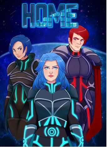

Spectrum

Written: PJ Haarsma & Alan Tudyk
Illustrations:  Sarah Stone
Producers:  Alan Tudyk, PJ Haarsma, and Nathan Fillion

This seems like it will be an awesome series. Spectrum was the first comic I picked on FCBD mainly due to me being a major Firefly fan, so when I saw this comic was produced by Alan Tudyk and Nathan Fillion, I clapped my hand and giggled like a little girl getting a Barbie (this is not an exaggeration I am sorry to say).

The story’s title is the name of the ship that will be featured in this series, and a picture with technical data is provided in this comic book.

On the inside of the front cover is a nice long backstory to provide the setting and useful information for the reader. This has been a great tactic started by the Star Wars movies and is used by smart writers of science fiction.

The artwork is good for the most part, but it has a bit of an odd element to the lines of it. That is the best statement I can make. Once you see the work you will understand. Other than that there is not much to say.

If you are a fan of the Firefly series, you will love this. If not, then you will still like this and you should watch the awesomeness known as Firefly.

Serenity:  The Warrior and the Wind

Script: Chris Robinson
Art: Stephen Byrne
Lettering:  Michael Heisler

Hellboy:  The Mirror
Script:  Mike Mignola
Art:  Richard Corben
Colors: Dave Stewart

Aliens Defiance:  Extravehicular
Script:  Brian Wook
Art:  Tristan Jones
Colors: Dan Jackson

There are three stories in this one free comic book. I was truly taken aback by the rude implantation of crap with my Firefly/Serenity story. That was very not nice.

Serenity: the Warrior and the Wind is a short story in which River, one of the main characters, is telling Emma, the daughter of Zoe and Wash (both main characters as well), a bedtime story featuring all of the cast. This is a very unique way to provide the backstory of the series mixed with a bit of fairy tale. By my admission, this is very clever.

The artwork and colors are astonishing although a bit cartoony. This fits with the theme of this short story, so my feeling is it is admissible.

Now we move to Hellboy: the Mirror. Even though I have never been a Hellboy fan, this is utter crap. Hellboy enters a house, looks into a mirror, is attacked by a ghost, and begs for it to stop. The ghost disappears, and then Hellboy leaves. The End. See what I mean – crap.

If that wasn’t enough, the artwork was painful to look at as well.

The third story in the book is Aliens Defiance:  Extravehicular. This story featured some very nice lines and color, but the story itself was very bland for starting in the heat of a fight. Realistically this should have been an exciting piece. The dialog and flow did not convey the intensity it should have.

Camp Midnight

Writer:  Steven T. Seagle
Artist:  Jason Adam Katzenstein

The opening for this comic book is:
“Skye’s parents put her on the wrong bus, and now she’s about to find out what it means to be the only human girl at an all monster camp . . .”

Now the theme and title scream children’s comic to me. This story also addresses some classic child themes such as fitting in, standing up to bullies, and being loyal to friends. What does this all mean? I was very bored reading this comic book. My daughter seemed to really like it, so I am right on the mark for the theme.

I really don’t want to address the artwork, but my obligation as a comic book critic deems it necessary. The artwork made me throw up in my mouth just a bit. The lines are not consistent, but the colors are. Each panel has a color . . . just . . . one . . . color. Can we say mono-tone?